Photo by: Photochrom image of Piccadilly Circus – no listed photographer (Londonist).
Image Address:
https://assets.londonist.com/uploads/2022/03/i730/piccadilly_circus__london__england.jpg
Image Source:
https://londonist.com/london/art-and-photography/early-colour-photographs-london-1900
Year Created: 1900
Principle #1: Depth of Field: This photograph is a good example of depth you can see far down the street. The roads allow for depth of field as the colors get darker, giving the image a greater sense of distance with the contrast. Additionally, the further the background goes back, the less focus the area has, which adds to the depth.
Principle #2: Rule of Thirds: I also think the rule of thirds is displayed as the green statue in the middle of the road is on the line. The statue's positioning and the point on top of the statue is at an intersect point which draws your eyes to the statue. This gives focus and balance to the picture while providing interest to draw you in.
Principle #3: Use of Lines: I believe the lines from the buildings and the street point you toward the stature. The lines guide you from the edges of the street corner to the main road where the cars travel. This movement helps orientate the viewer to the center of the image, in this case, the focus area of the statue.
Why did I choose the image?
I chose this image because I find it fascinating to see the streets of an earlier city. Cities have always been the centerpiece of our society, and seeing how the town used to look gives you a good example of how those people would have lived their lives. Also, I find compositional principles well laid out with pronounced lines and depth.
What feelings did this create?
The feeling this image creates for me is that of an energetic city. It reminds me of the culture and time; it is busy but also seems calm compared to today. I also feel a sense of excitement, the city is alive with activity.
Photo by: The image is of a Chicago-based Federal Steel Company – no photographer listed (White Knuckler Brand).
:https://cdn.shopify.com/s/files/1/0256/0416/1584/files/whiteknuckler-brand-steel-1901-1950-2_da3a4159-4c39-4ef6-8724-403a2b2fbb4a_1024x1024.jpg?v=1666387589
Image Source:https://whiteknucklerbrand.com/blogs/wk-blog/early-american-steel-history-1901-1950
Principle #1: Shadows: I think this image is a good example of shadows. The light coming into the room contrasts with the darkness of the space. This guides your eye to focus on the few areas that a bathed in sunlight, allowing the subject to be brought into focus in this large and cluttered space. Perhaps this also gives interest into the darker shadowed areas as you focus from light to dark exploring the image and what is hiding in these deep shadows.
Principle #2: Quality of Light: The direction of the light impacts this image by illuminating the subject (person) and creating shadows from the mental equipment scattered throughout the structure. The lighting is dramatic! Having so little light percising the darkness, what little is illuminated is immediately interesting.
Principle #3: Black & White: The impact of this image as a black and white photo allows it to emphasize shadows and light. I believe this image was taken in a time when only black and white was around, but it would not have been the same if it was a color photo. I think the emphasis that black and white gives with the depth of saturation of only black and white gives it more emotion and interest.
Why did I choose the image? I chose this image because I found it represented light in an incredible and impactful way; it tells me a story. I like the factory setting; I see the look of it as interesting – a large structure that feels isolated – another world off into the mist. Interestingly, only one living person is in the factory, not as busy and full of life as expected.
What feelings did this create? I get a sense of isolation from the image. This is out of step with my thought process of a factory. I would expect movement, business, and people; you almost want to feel loud and hot, but I feel isolated, not what I expect from the scenery. It is ironic one worker can not contribute to the work; it is a team effort, so, oddly, it is a solo worker, this interested me. I get a sense of stillness.
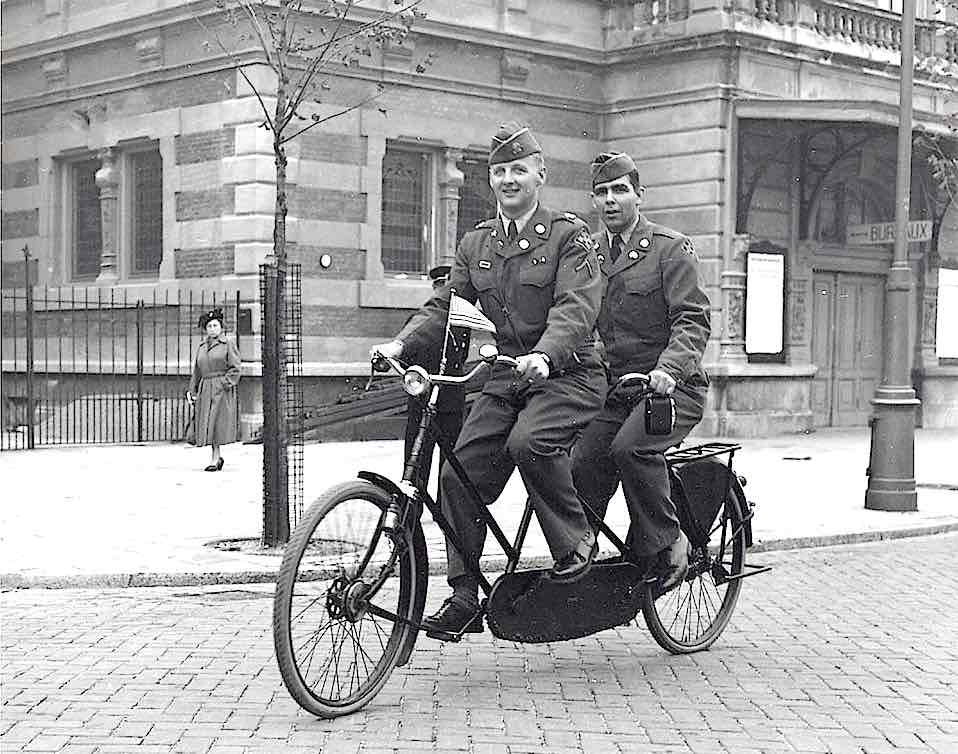
Photo by: No photographer listed: American soldiers at Leidse Square on a tandem bike—picture taken September 6, 1951 (Amsterdam Redlight District).
Image Address: https://www.amsterdamredlightdistricttour.com/wp-content/uploads/2016/08/Amsterdam-in-Pictures-6-September-1951-Leidse-Square-American-Soldiers-Bicycle.jpg
<Image Source: https://www.amsterdamredlightdistricttour.com/news/amsterdam-in-pictures-1951/
Principle #1: Keep it Simple: I find the photo's composition having the subjects framed between the tree and the pole creates a nice balance. The lines from the pole draw your eyes upward to take in the rest of the image. Additionally, the edge of the grip road draws the line towards the subject, giving more focus. A simplistic background keeps the focus on the two men on the bike.
Principle #2: Obvious Main Subject: The bike takes a good portion of the image, along with the two men on it. There is not too much space on each side of the subjects, allowing the viewer to keep focus on the subjects, being larger or smaller would not have allowed for such focus. Accurate proportion is the key here; however, the woman in the background does provide some distraction; she is barely coming out from behind the pole; her absence may have made this principle more defined.
Principle #3: Subject's expression: This appears to be a snapshot; it was not staged (explains women in the background). Their expressions looked relaxed like they were having fun but not posed because they were not smiling. The body positioning fits the image well and gives the image a sense of motion as their legs are positioned to propel the bike.
Why did I choose the image? I chose this image because I felt it was uplifting. Two soldiers riding on a bike seemed almost joyful in a challenging time of their lives. I thought they could be a stand-in for many different military branches: pilot and copilot, two soldiers in the same platoon, two brothers together – on the same vehicle dependent on each other just like soldiers depend on each other during warfare.
What feelings did this create? This image gives the feeling of some joy, and the men are wearing uniforms, so you know it is a difficult time, wartime, which does not have much joy. This gives the feeling of high spirits – upbeat morale—a moment in a war film where everything is going smoothly and you have a moment of contentment.


Comments
Post a Comment